Intro—Project Overview

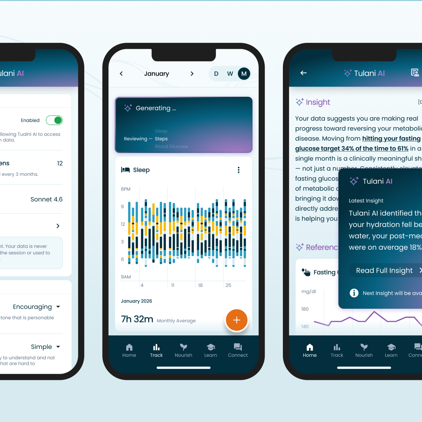
Live Tula is a metabolic-health program that helps people reverse chronic conditions like Type 2 diabetes through sustainable behavior change. Members get a care team of coaches, nurses, and dietitians, a meal planner and tracker, and health metrics integrated from smart wearables. This project introduced Tulani AI, an in-app companion that turns those metrics into personal insights.

Role
As Live Tula’s sole designer, I reported to the President. I owned the problem framing, research, and end-to-end design of Tulani AI. I partnered with the AI Architect on feasibility and constraints, and with the Head of Strategic Alignment on priorities and capacity. When the first redesign did not move engagement, I pushed the team to go back to members and coaches before building more, which changed the direction of the project.
The Problem
Members started strong, tracking sleep, activity, glucose, and meals. After about 4 weeks, most of them stopped engaging.
Early Signal
15% Lift in Daily Active Use
Measured across 1,000 early adopters over 3 months.
Program Impact
3% Decrease in Health Care Costs
Companies that offer Live Tula as a health benefit see this impact after the first year.
Overview—The Solution, End to End
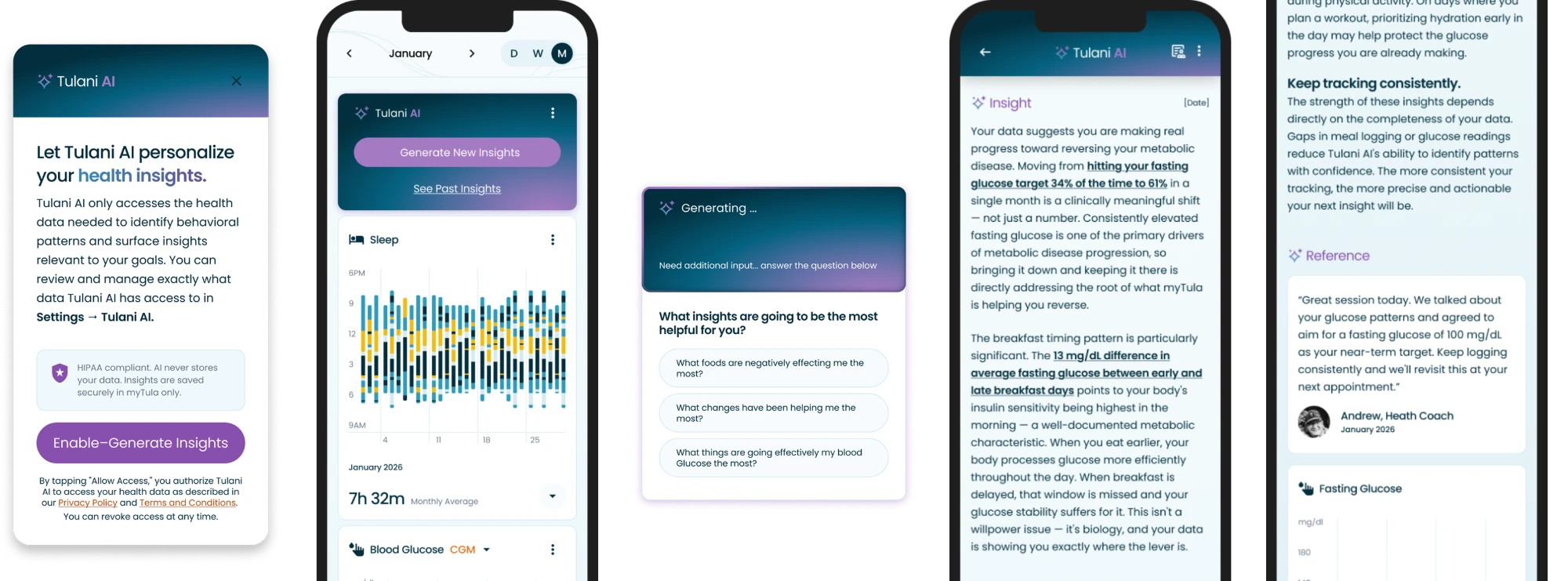
From opt-in to action, this is how a member uses Tulani AI to turn their own health data into a next step, with their care team still in the loop.
01
Opt In
Members choose to turn on Tulani AI and see exactly which data it can access.
02
Generate
One tap creates an insight. No prompt writing needed.
03
Guide
Targeted questions narrow in on the insight that matters most.
04
Act
Takeaways turn the insight into a clear next step.
05
Verify
References show the exact data behind every insight.
00—Problem Framing
Members were dropping off, and the team assumed better charts and easier logging would fix it. After we shipped the new designs, engagement stayed flat. That told me the problem was not the interface.
The Problem
Data Visualization
The team agreed the fix was to make the data more visually engaging and make logging easier, so I designed that experience first. I focused on:
- Changing totals to timelines
- Reducing clutter and improving visual hierarchy
- Improving interaction patterns
- Removing friction from manual inputs
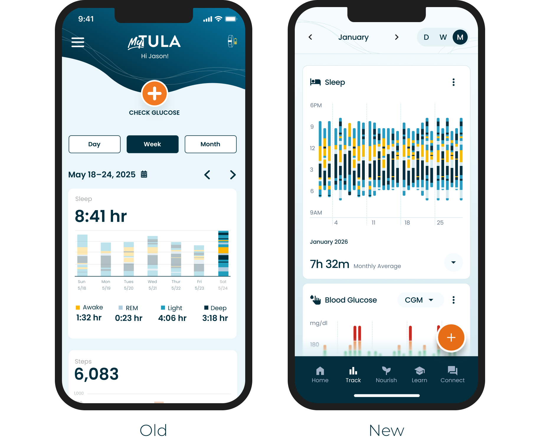
Result of the redesign
After 10 weeks, engagement stayed flat. The problem was not the interface.
01—Reframed
When the redesign did not improve retention, I needed to understand why. I built two surveys: one for the health coaches who work with members every day, and one for members.
AI-enabled Research
Synthesized Research in Minutes, Not Days
I surveyed 15 health coaches and 25 members to understand why engagement dropped.
I used Airtable to house and synthesize the responses, and its AI features to surface common themes and outliers in minutes instead of the days manual synthesis would have taken.
A significant number of members described the same gap: they could see their data, but did not know what to do with it.

Reframed Problem Statement
Members were collecting data they could not interpret, so tracking stopped feeling worth it.
02—Product Strategy
Members did not see enough value in tracking their health metrics. I needed to design a feature that helps members turn their own data into behavior change.
AI Product Framework
Mapping Needs to AI Functions
Was AI a good fit for this problem?
To answer that, I used a framework taught by NN/g for deciding when a co-intelligent solution is the right fit. You identify the core of the problem, then map it to one of the 4 ways AI can help.
Our problem mapped to Volume and Expertise: members had more data than they could read, and not enough expertise to interpret it. That pointed to Help Me Understand, which made AI a strong fit.
Step 1
Identify The Core Of The User Problem
Each problem statement maps to at least one of these 6 categories.
Volume
Decision
Expertise Discovery
Time
Quality
Note—AI Archetypes
When building a co-intelligent solution, it is important to understand how members will perceive it. Our members were most likely to treat Tulani AI as an Oracle: an authority that gives answers. In a health context, an authority that is wrong is risky, so every insight needed to show its sources and point members back to their care team.

Oracle
Users see the AI as an authority, not a collaborator. They expect definitive answers and want to know where the information comes from.
This archetype shows up when your product is perceived as an expert: research tools, Q&A products, anything presenting knowledge rather than options.
'You ask. It pronounces.'

Intern
Users bring healthy skepticism. They know the model can be wrong and expect to review its output before trusting it.
This archetype shows up in meeting transcription, writing assistants, and tools that take monotonous, time-intensive work off users' hands.
'Eager. Fallible. Needs Supervision.'

Collaborator
Users see the AI as a partner in the work, not a source or a servant. It helps them produce better output by filling gaps and offering insight along the way.
Products matching this archetype use permission gates and planning modes, and ask clarifying questions before proceeding.
'Peer. Plans together. Asks before acting.'
03—Jobs To Be Done
Before designing, I used the Jobs To Be Done framework to understand the full scope of what this feature needed to do. Mapping the Four Forces was the most influential part, because each force pointed to a specific design response.
JTBD Four Forces
Adoption

Pushes Away
Data piling up with no payoff. Members track daily, then ask: now what?
Design response: insights with clear Takeaways, so every check-in ends with a next step.
Adoption
Pulls Toward
Personalized answers on demand, with immediate gratification and a sense of ownership over their health.
Design response: one-tap generation that returns a personal answer in seconds.

Resistance to change
* Anxiety & Fear
Can I trust AI with my health data? What if it's wrong?
Design response: explicit opt-in, data access transparency, and auditable References.
Resistance to change
Habit
Passive tracking is comfortable. Questioning your own data is a new behavior that takes too much effort or understanding.
Design response: no prompt writing, plus guided follow-up questions that do the questioning for members.
* The Four Forces surfaced our biggest challenge: trust.
How might we foster TRUST in this co-intelligent companion?
04—Building Trust
Health data is sensitive. Explicit opt-in, transparent data access, and clear controls are non-negotiable design requirements before any AI can see a member’s personal metrics.
Trust & Explainability
Opt-in & HIPAA Compliance
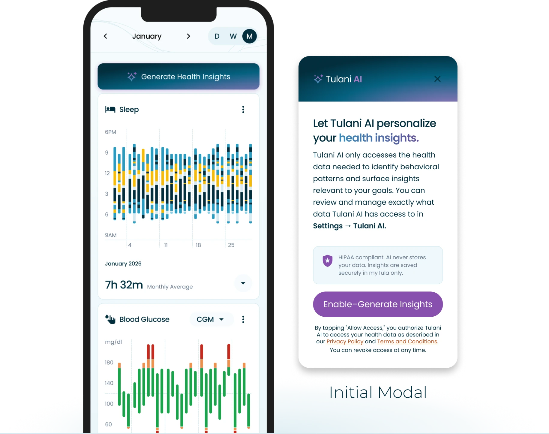
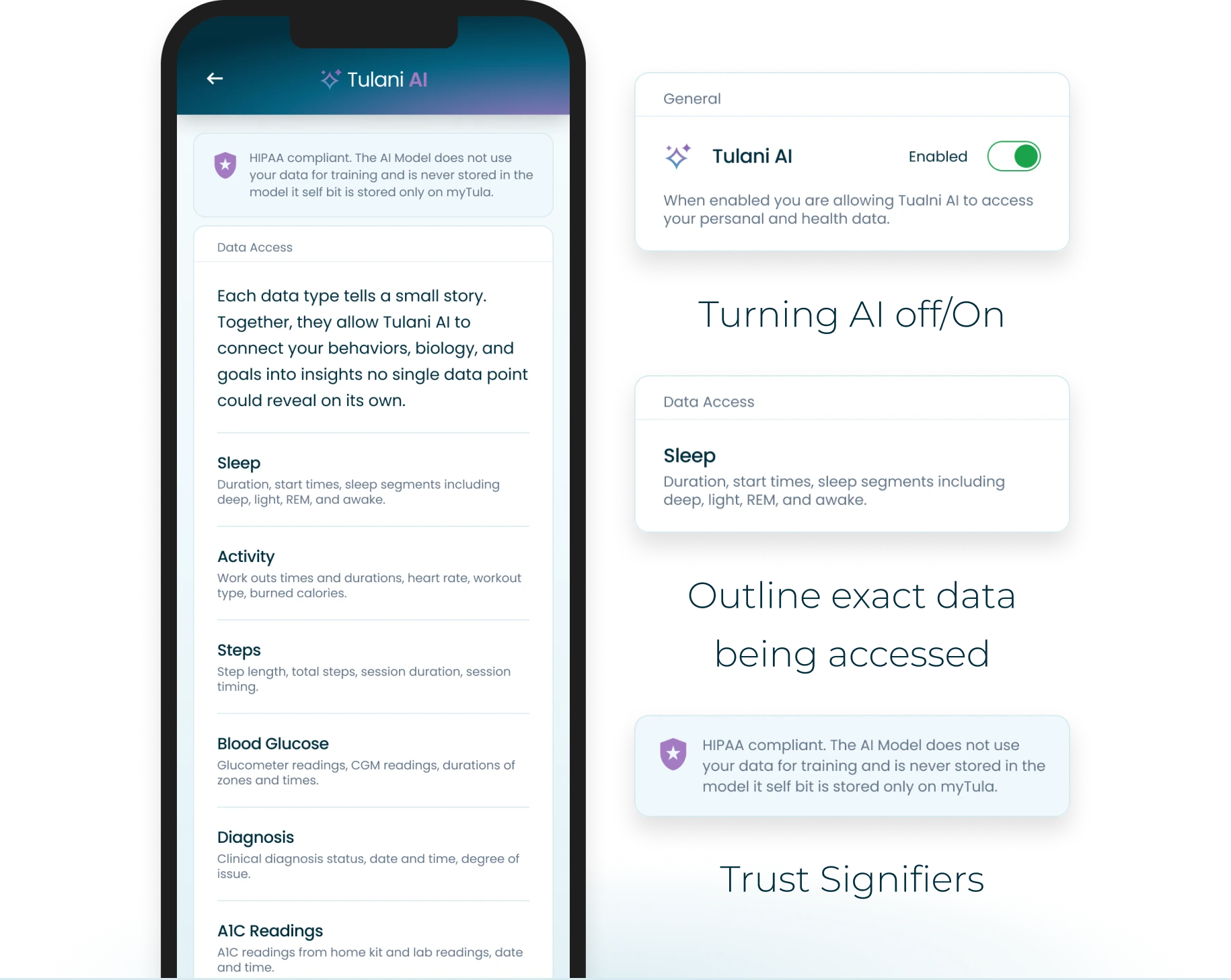
Users’ default response to AI systems is healthy skepticism, and rightly so. To support feature adoption and maintain HIPAA compliance, users must explicitly enable and opt in to Tulani AI before the system can access any of their personal health data.
Trust is built before the first insight is ever generated.
Building Trust
Data Access Transparency
The biggest challenge in implementing AI is helping members feel comfortable letting a system access sensitive personal data. Trust that the system handles that data responsibly is essential, and transparency is the primary tool for earning it. Members can see exactly which data Tulani AI uses and can turn it off at any time.
Personalization & Control
Tone, Language & Control
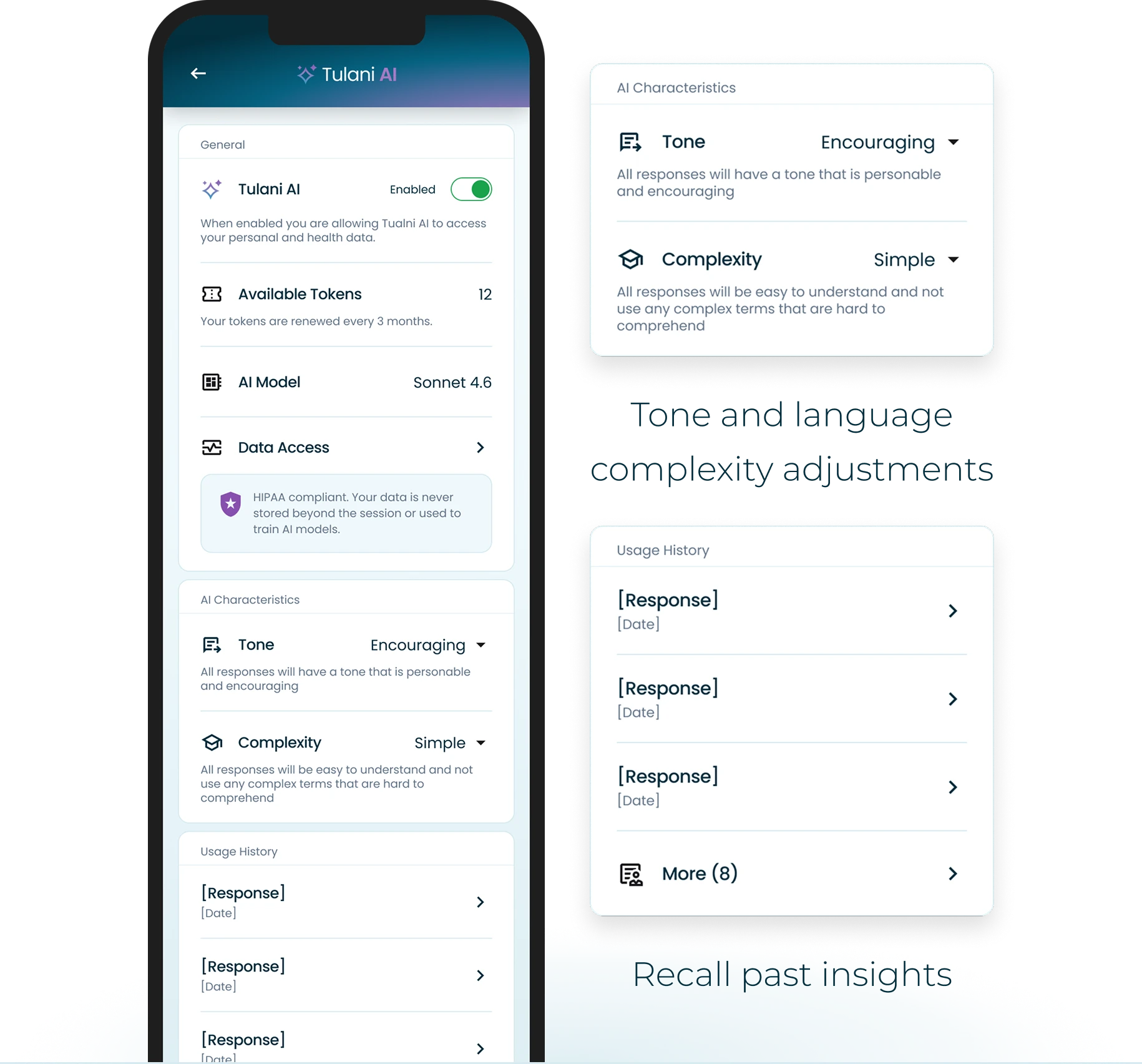
Because Tulani AI’s outputs are language-based insights, the system needs to meet members where they are. Responses that feel too clinical or detached can alienate the very people the product is trying to support. We added response settings that let members adjust the tone and language complexity of their insights, so the experience stays encouraging, readable, and light on cognitive load. Members can also recall past insights to see their progress over time.
05—Usability & Trade-offs
Writing effective prompts is a skill most members don’t have. One-click generation removes the cognitive burden while guided follow-up questions help surface what’s actually useful.
Usability
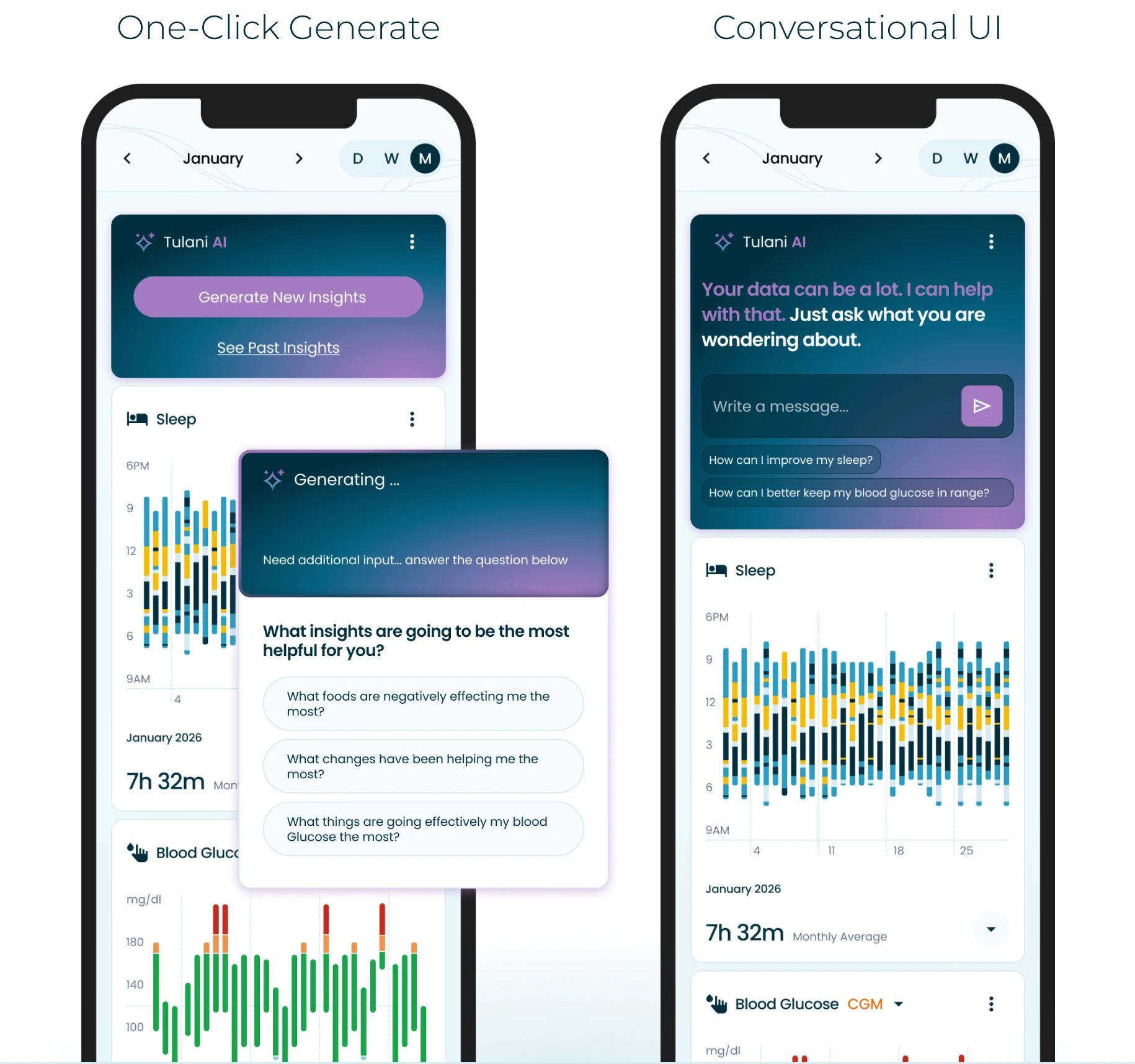
One-Click Generate & AI Guidance
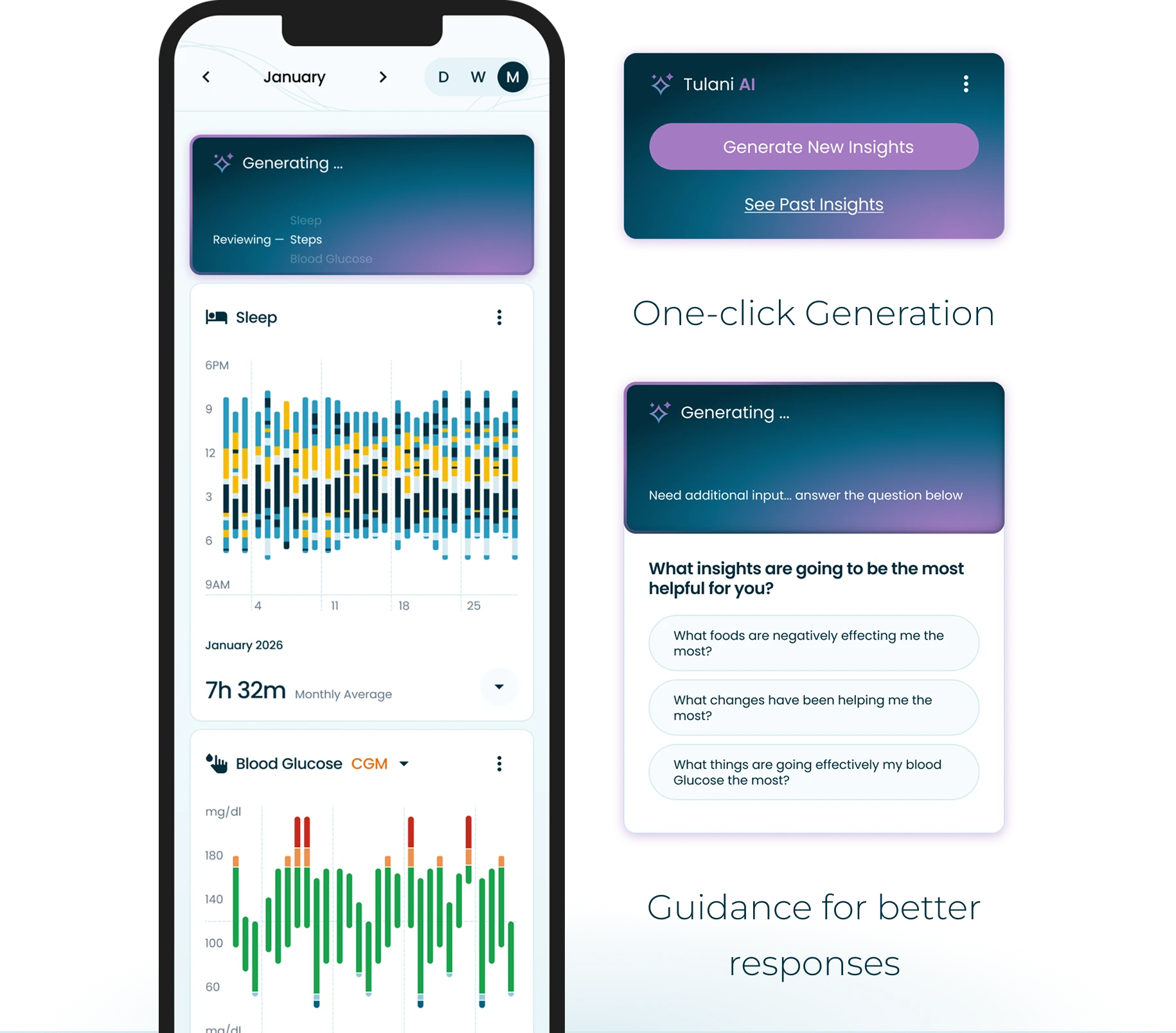
Our research showed that members lacked the domain expertise to prompt an AI model effectively, so complex health data would go uninterpreted and the feature would go unused. To minimize the learning curve, we designed a one-click generation experience that removes the need to know what to ask. When the AI needs more context, it asks targeted questions about which insights would be most useful, guiding members toward better outputs without requiring them to understand how the model works. This mattered most for older members and members less comfortable with technology.
Decision Point
Structured Controls vs Conversational UI
When exploring how members would start generating insights, we considered a conversational UI and a simpler, structured interaction model.
Conversational UI did not fit because:
- Cognitive load: it relies on members already knowing what to ask.
- AI fluency gap: older members and those less comfortable with AI would struggle to write effective prompts.
- Guardrails: a structured, button-driven interface is far easier to constrain and validate than open-ended prompts, keeping responses within safe bounds.
One tap. No prompt-writing skills needed. Actionable, reliable insights in minutes.
06—Response Reliability
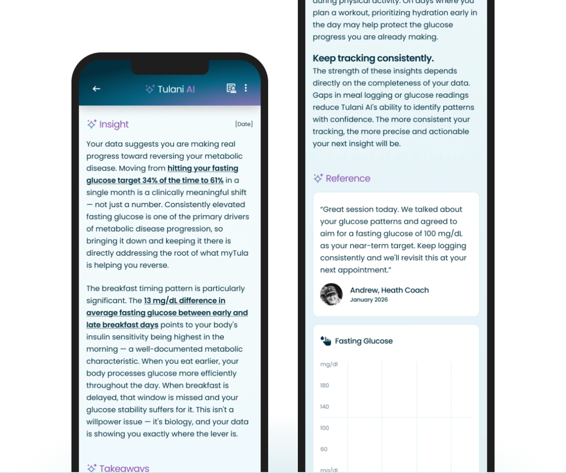
The model can generate unhelpful or inaccurate responses. In a health context, eroding trust is particularly costly. Takeaways and auditable references were designed to let members verify the basis of any insight.
Grounding & Oversight
Guardrails, Training & Feedback Loops
To align responses with the Live Tula program, we used retrieval-augmented generation (RAG) to ground the model in the Tula 10: a proprietary, 100+ page document outlining the 10 principles that guide all care. These principles provided guardrails for the model’s responses. The model also referenced health goals set by health coaches to ensure each response supported those goals.
As an extra layer, and to keep a human in the loop, health coaches, nurses, and dietitians reviewed responses. This ensured that every response lived up to the standards of the Live Tula program.
Building Trust
Actionable & Responsible Insights
Every response includes a Takeaways section with actionable next steps and a References section where members can audit the exact data points behind the insight, making the AI’s reasoning visible and verifiable.
07—Limitations
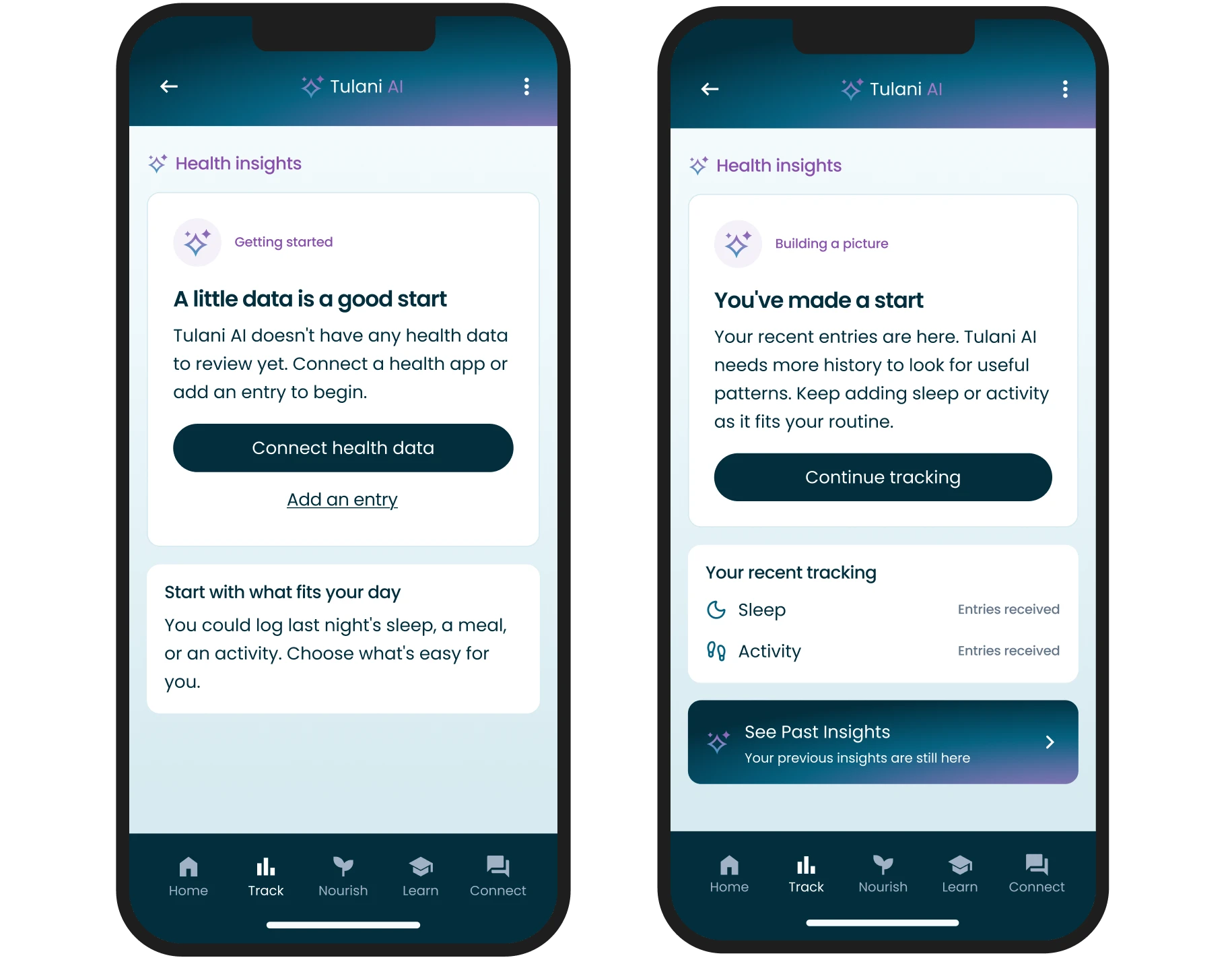
To balance data thresholds and token costs, I designed graceful states that never lead members to a dead end, with clear and specific microcopy.
Cost-Aware Design
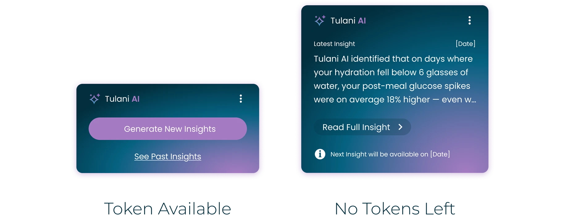
Cost & Limited AI Tokens
AI tokens are expensive, so limiting how many each member can use is essential for managing costs at scale. Exact pricing depends on the model and data volume. We set a limit of 1 insight per member per month. I also designed the state where a member runs out of tokens, so they always understand what happened.
Building Trust
Graceful Errors
When a member hasn’t logged enough health data to generate an insight, graceful error states explain the limit and suggest how to keep going.
Postscript—What I Would Do Next
When I left the project, Tulani AI was with early adopters. These are the open questions I would tackle next.
Identify AI Model & Cost
Early adopters used an interim model. Choosing the long-term model was still open. Next, I would compare models on cost, response quality, and reliability using a shared set of real member scenarios.

Budget & Performance
Validating Solutions
We had confirmed we were designing the right thing. Next, we needed to confirm we designed it right. Engagement was increasing, but we had not yet circled back with qualitative research. My next step would be follow-up interviews with early adopters and coaches.

Design Objective
HIPAA & PHI Compliant
HIPAA does not include AI-specific guidelines. During BAA negotiations we would need to define contracts, safeguards, and clear boundaries around what data the AI can access and whether any retention is permitted.

Compliance Objective
Data Thresholds
Every member has a different threshold for how much data they are willing to enter manually, and food logging is the most demanding example. Next, I would test the minimum data Tulani AI needs to generate meaningful insights.

Feasibility Objective